Table of contents
Why Should I care?
Maybe you shouldn't, idk what you're trying to do. For me though, I care about mobile-first design because I don't want to have to rewrite my whole app when I realise I want it to look good on all screen sizes.
How should I care?
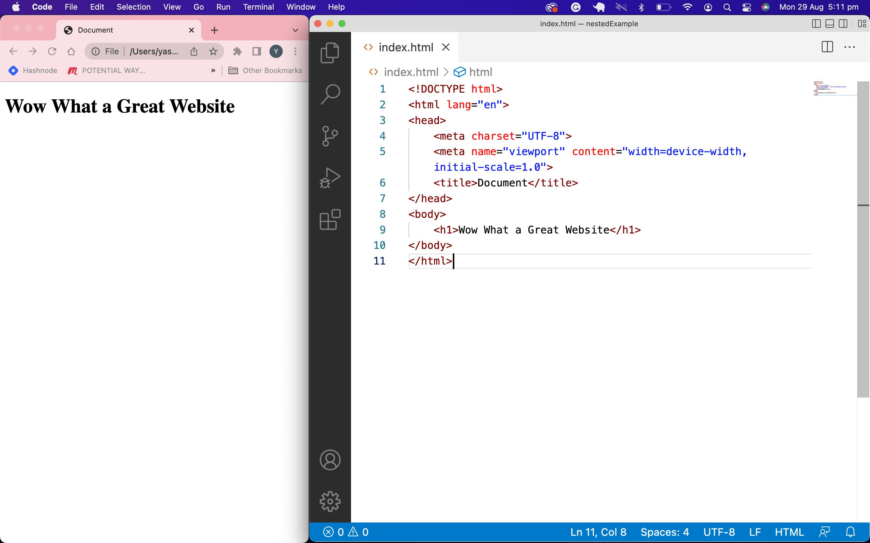
When you're starting a new project, make it look good on the smallest screen size you can be bothered caring about and work your way to the larger sizes in increments using media queries. Your browser's dev tools will probably have some options for simulating all kinds of devices, but rather than iterating through all of them, you can just start by making the browser window small like this.

One thing that's incredibly important to leave the hell alone is this line.
<meta name="viewport" content="width=device-width, initial-scale=1.0">
Trust me. Or don't and read more about it here.
Normalising
Another thing that's generally advisable is to include a normalised stylesheet before adding your own like this.
<head>
    <meta charset="UTF-8">
    <meta name="viewport" content="width=device-width, initial-scale=1.0">
    <title>Wow, Great Site</title>
    <link rel="stylesheet" href="css/normalise.css">
    <link rel="stylesheet" href="css/style.css">
</head>
<body>
The order is important here, we want the normalised file to load first. I'm using this one. Visit that link to read the documentation. Here's the terminal command to run in your css folder: curl https://necolas.github.io/normalize.css/latest/normalize.css >> normalise.css
Media Queries
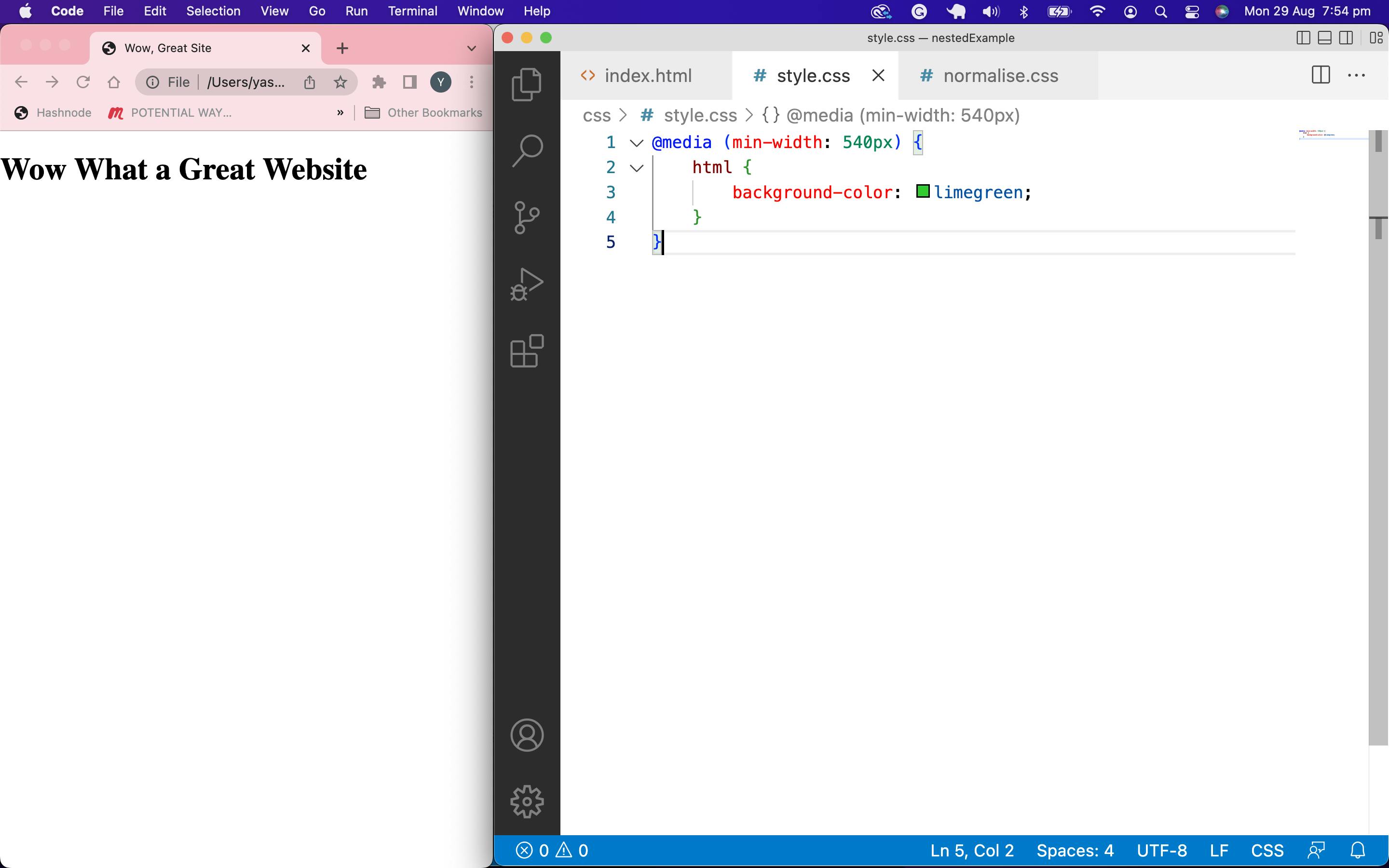
For a quick demo to see what size-specific CSS is, let's throw this into our CSS file and adjust our screen size accordingly.
@media (min-width: 540px) {
    html {
        background-color: limegreen;
    }
}

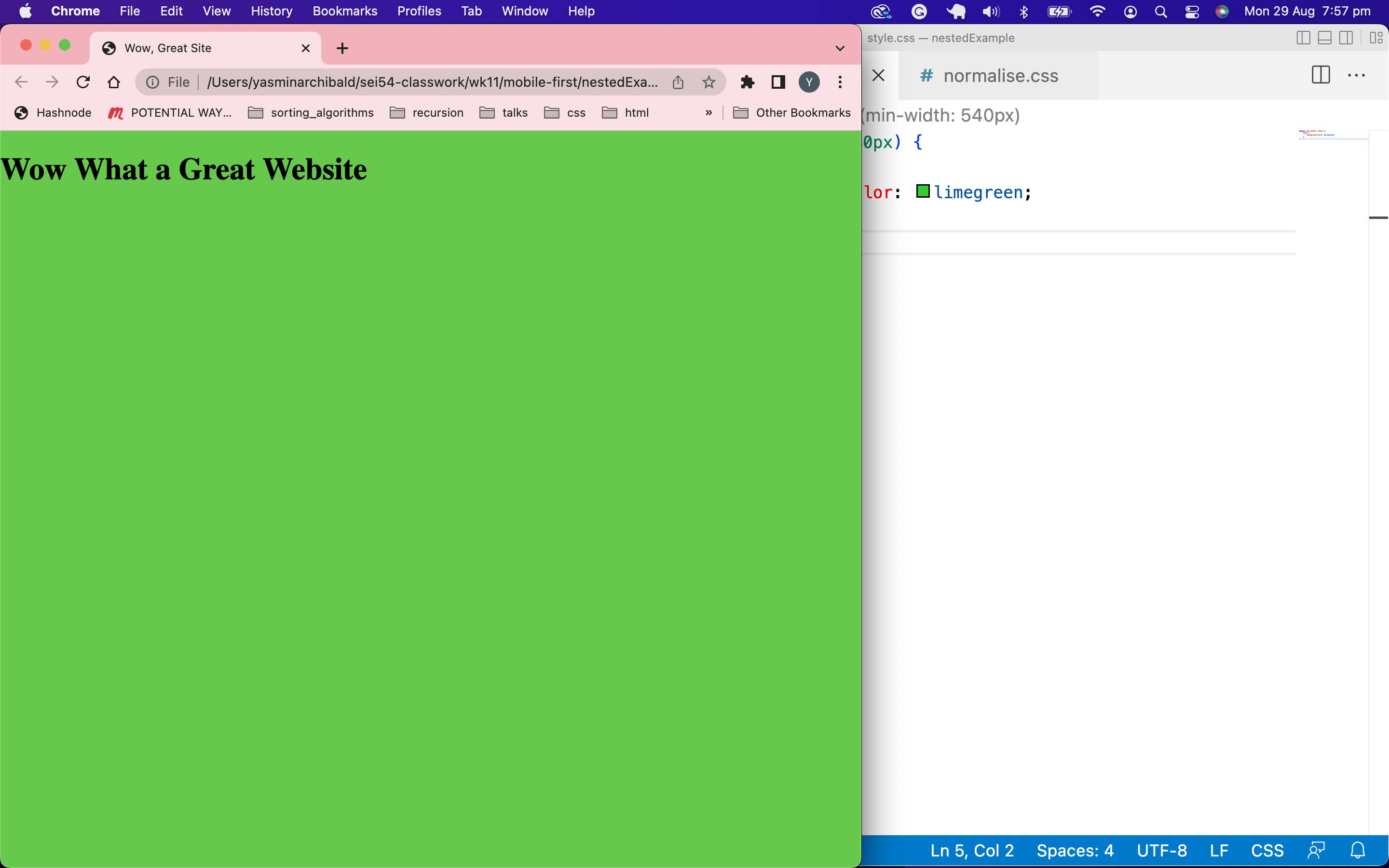
Resize, and viola. A tasteful lime-green for everyone but our unloved mobile users who don't deserve the visual treat.

The idea is to incrementally increase the px size until you've covered the essentials. We're working additively rather than subtractively as it's easier to build things up than it is to strip them back down again.
