


Table of contents
I'm into artsy code stuff, but historically, I haven't had the attention span for math. Unfortunately, it wasn't one of those classes I could zone in and out of, picking right up where I left off. Now that I'm capable of sustained attention and am finally taking my wobbly first steps as a fully alive human, thank you ADHD diagnosis, I'm teaching myself math from the ground up.
Luckily with code, there's a lot more room for experimentation. I can test things out even when I don't understand them. In the process of watching it work or not, I understand it a little better. Throwing things together and seeing what works in this way is great up until a point, but after a burst of success followed by the unfortunate but inevitable part where I hit a wall, it's time to go slowly and break things down.
The process of pulling things apart until I get down to the basics helps me push past the wall and start problem-solving about the more complicated things I'd like to be doing with my code.
Since just about everything to do with drawing things in JavaScript involves working with x and y coordinates, I've broken down that concept to better visualise all the moving parts involved in working those out. This post represents some of the process I took to understand the pixel grid and how things are positioned within it.
The Pixel Grid
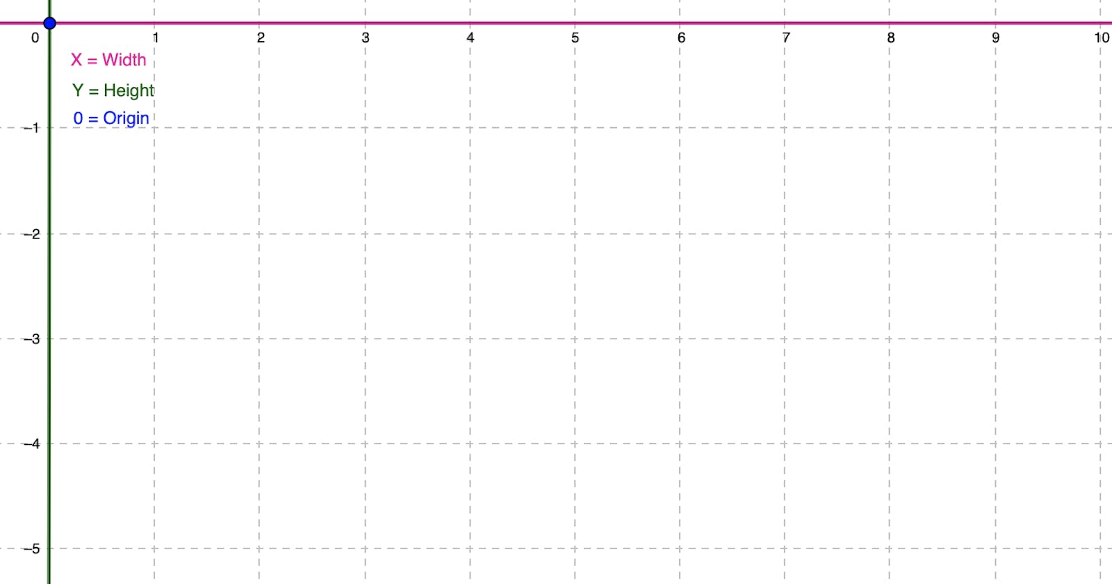
We all know that people view webpages on many different screen sizes, so their pixel grids are all different. But what the heck is a pixel grid? A pixel grid represents all the pixels stacked side by side, row by row, all the way across and up and down the length of your screen. The origin position is a fixed point against which all the other coordinates are measured against.
In web development, the convention is that the horizontal axes is X, while the vertical axes is Y. That could be the width and height of your screen, for example. See here for an intro to the concept of the coordinate plane.
The origin is the point at which the grid begins in each direction, the toppest leftest position. The zeroyest X and the zeroyest Y.
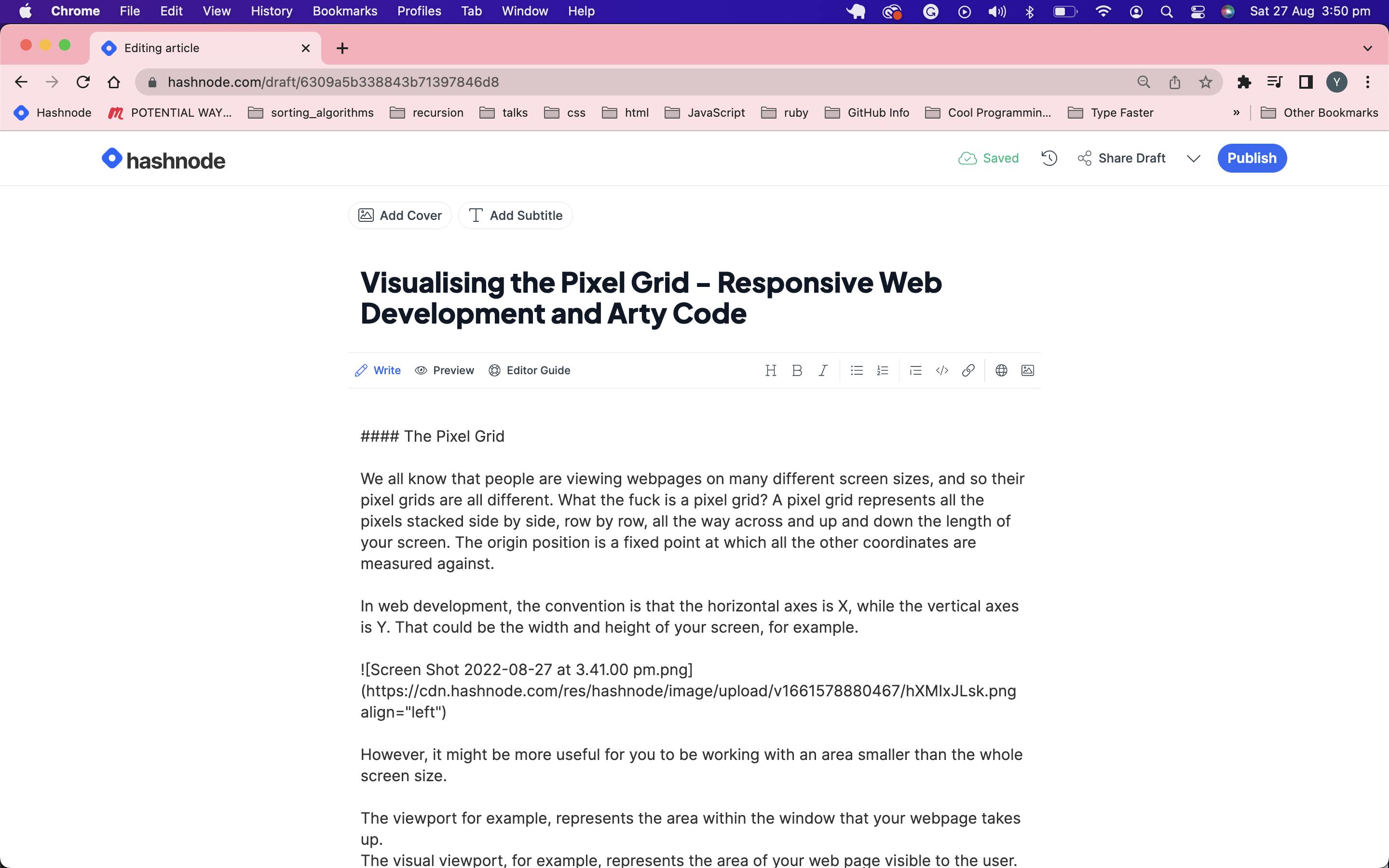
However, it might be more useful for you to be working with an area smaller than the full screen size. The viewport, for example, represents the area within the window that your webpage takes up.
Look at this screenshot of this page I took while writing this blog post. Notice the toolbar up top. Then the Tabs section within my browser and bookmarks. Eventually, we get down to the space that the Hashnode webpage occupies. It's not the window entirely; it's the viewport. Specifically, it's the visual viewport. The Viewport is made of the layout viewport and the visual viewport. The layout viewport is the page in its entirety, and the visual viewport is the area that the user can currently see. If they pinch in and zoom, for example, the visual viewport is a smaller area of the whole page.
The CSS Object Model and Coordinates
The CSSORM is what allows us to manipulate CSS with JavaScript, and it has four coordinate systems built-in. The only difference between them is where the 'origin' is located.
The Client model's coordinate system uses the top-left corner of the viewport as its origin. The Page model uses the top-left corner of the entire document. The Screen model uses the top-left-most point of the user's entire screen space. Using the offset model, the top-left corner of whatever element you add the event listener to is the origin. This seems like an easy one to default to IMO, but feel free to read more here.
Let's just be super general to get our heads around the concept and specify the window to get a look at what's going on under the hood with some console.logs.
Make a basic index.html and take it to your editor. If it hurts you to mix up HTML and JavaScript like that, same, but it fits in a blog post better this way. Feel free to separate them. Otherwise, just throw in the following code.
<!DOCTYPE html>
<html lang="en">
<head>
    <meta name="viewport" content="width=device-width, initial-scale=1.0">
    <title>Mouse Move</title>
</head>
<body>
    <script>
    window.addEventListener('mousemove', function(e) {
        let x = e.offsetX;
        let y = e.offsetY;
        console.log("X: ", x, "Y: ", y)
});
    </script>
</body>
</html>
I still get a weird kick out of opening the console and watching it log out the positions. Look at it go. So much information is being tracked with such little code. Oh the possibilities.
To get a feel for how the pixel grid changes with screen size adjustments, use the following code and refresh the page with your browser's window resized.
<!DOCTYPE html>
<html lang="en">
<head>
    <meta name="viewport" content="width=device-width, initial-scale=1.0">
    <title>Mouse Move</title>
</head>
<body>
    <script>
    console.log(`window width: ${window.innerWidth} window height:
    ${window.innerHeight}`)
    </script>
</body>
</html>
The window.innerWidth represents the highest value on the x-axis and the window.innerHeight represents the highest value on the y axes of the grid. It'll go all the way from origin to those values in either direction.
I hope this helps you to picture what it is you're doing when manipulating things based on coordinates! It's a weird thing to visualise without some context, but even with all this info, it'll take getting used to. Try console logging the coordinates on a click event, but guessing where the x and y are roughly before you click. When I take the time to guess what my code is doing before I execute it I find that I can rationalise about it better and better over time.